Marketing Cloud Account Engagement
B2B Marketing Automation
Grow revenue and scale customer engagement with B2B marketing automation software built on the world's #1 AI CRM. Scale account relationships with AI and unite your customer data on one platform.


What can you do with B2B marketing automation software?
Drive efficient growth and align your teams with a B2B marketing automation platform.
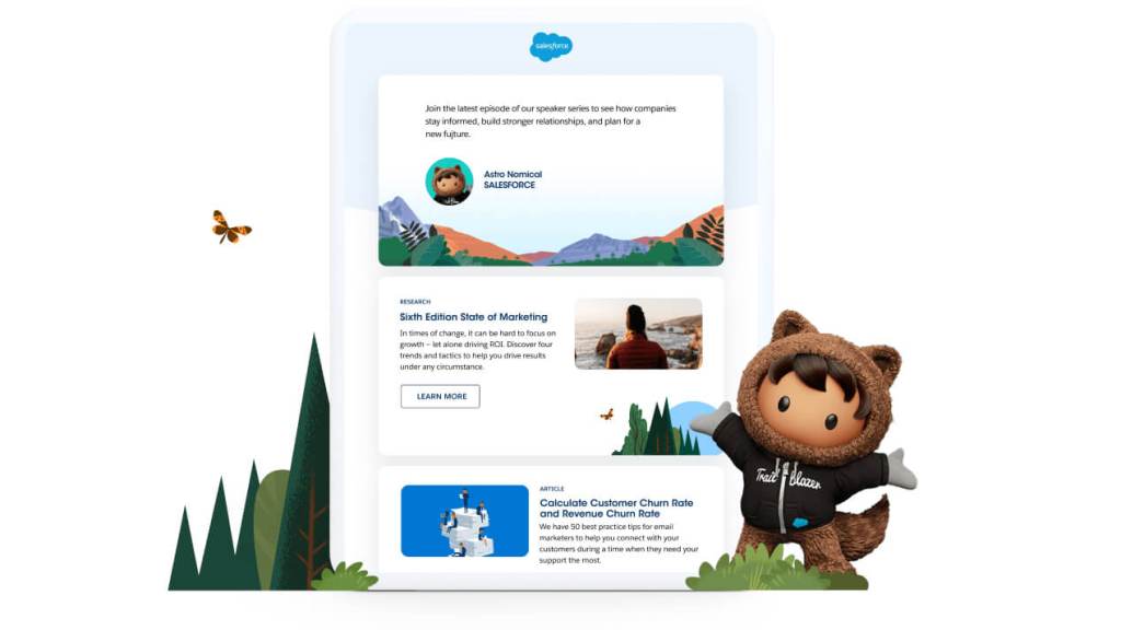
Deliver connected customer journeys and engage buyers across accounts.
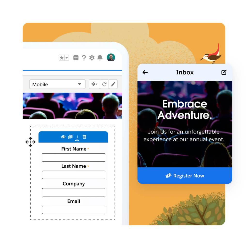
Create landing pages and forms fast using drag-and-drop builders. Segment leads at the point of capture, and send them on personalized, automated, cross-channel journeys. Using AI-powered lead scoring and grading, you can quickly nurture those leads for marketing qualification.
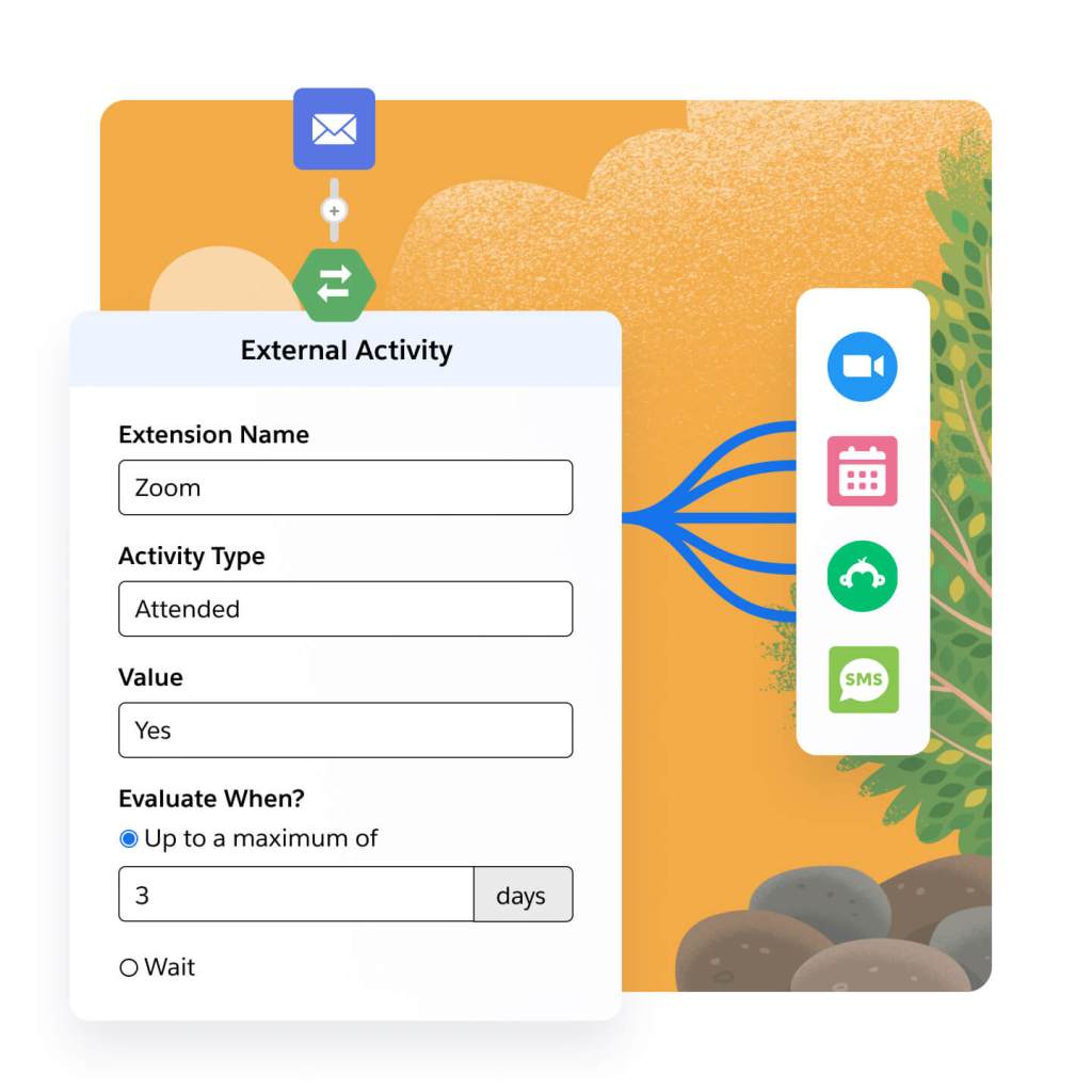
Engage prospects across every channel. Connect third-party webinar, survey, and SMS apps directly to your marketing programs. Trigger webinar and event registrations, survey sends, and SMS sends in your automated journeys. Connect engagement data, like third-party webinar, survey, and SMS data, for easy segmentation and campaign maintenance.
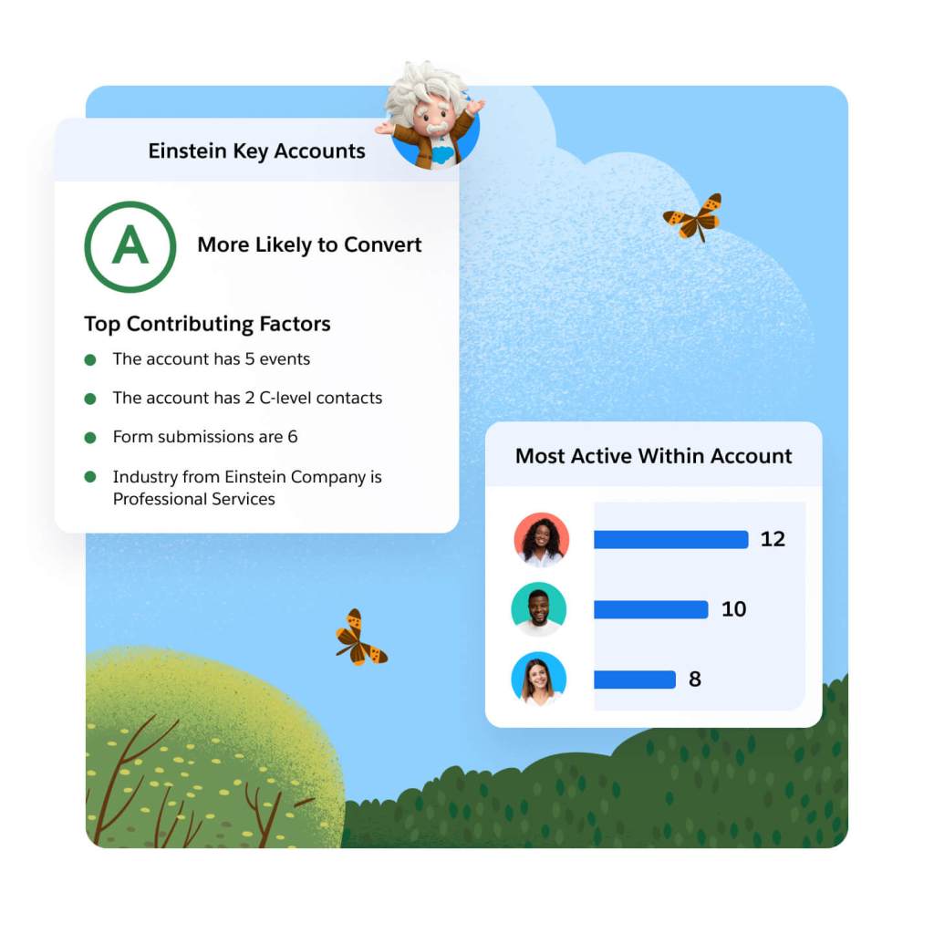
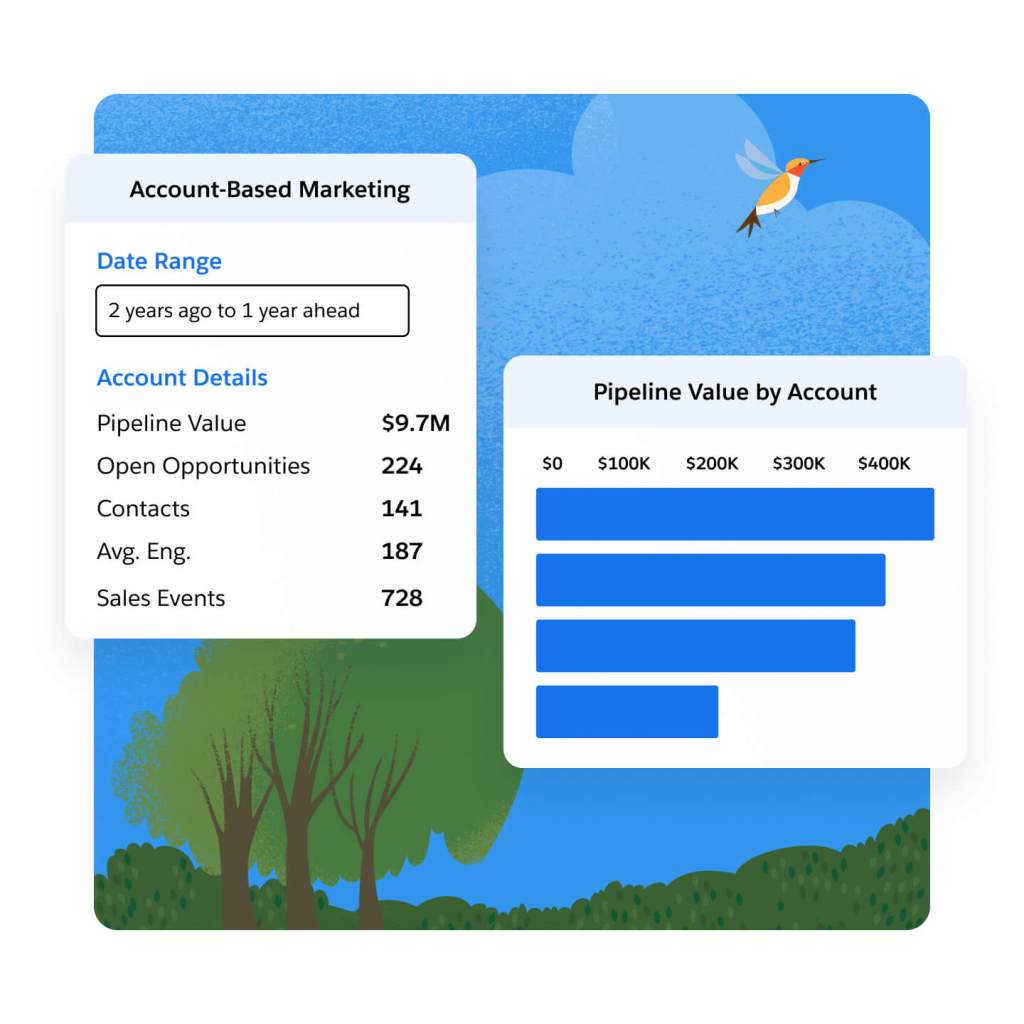
Discover and engage your best accounts. Target and nurture key prospects with the help of sales and service, by aligning on one platform. Let Einstein identify the accounts with the highest likelihood to purchase using key account insights. Track pipeline progress on target accounts using the Account-Based Marketing Dashboard, and use insights to refine your marketing and sales efforts.
Align revenue teams on a single source of truth and close deals faster with AI.
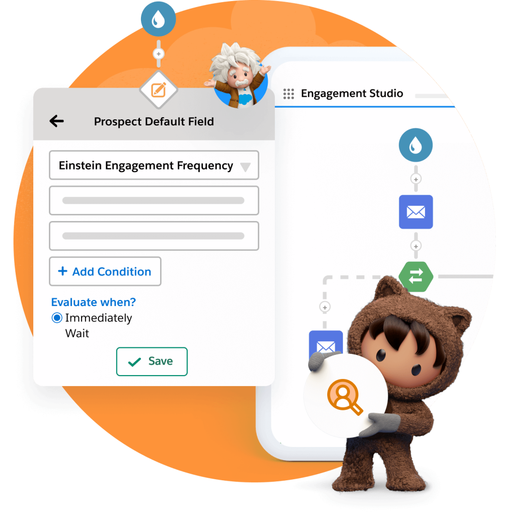
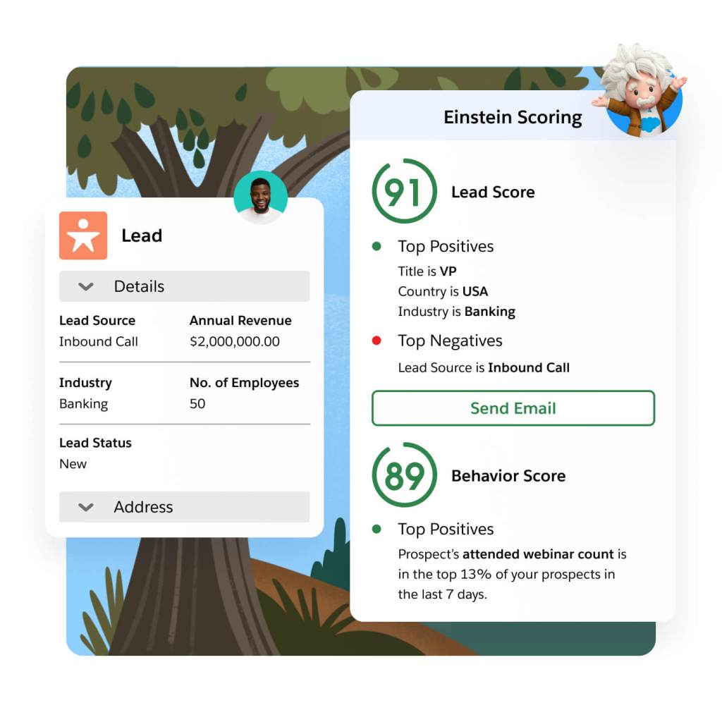
Take the guesswork out of lead and account scoring. With Einstein, you can leverage behavior to score and identify the leads most likely to convert, based on their interactions with your marketing efforts. Determine if leads match your ideal profile based on those who converted in the past. Let Einstein analyze key account data to help you find the accounts most likely to buy.
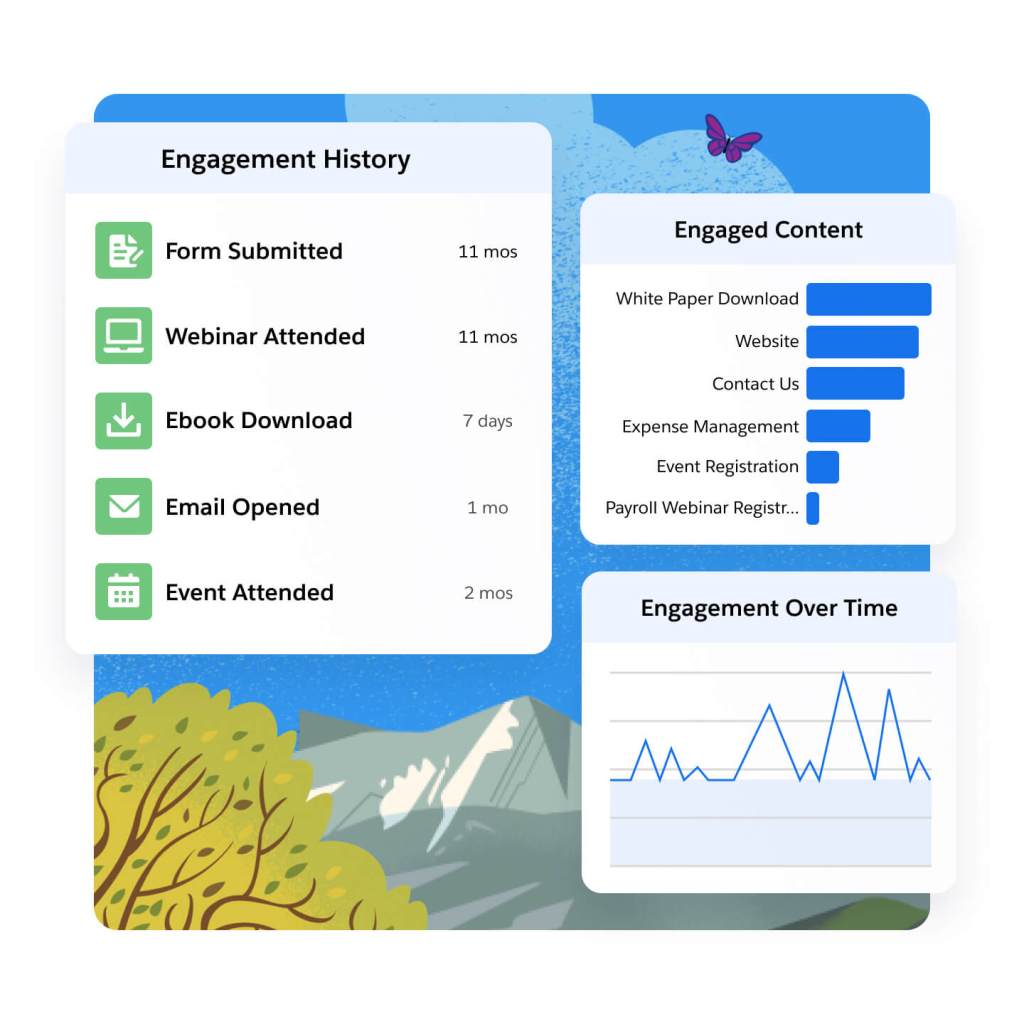
Gain comprehensive insight into your prospects. Connect and share prospect and customer engagement data with sales and service teams. Analyze prospects' interactions with your marketing, and use that information to identify champions on the buying committee. Understand how leads are engaging with your marketing on the campaign, individual, and account level using dynamic dashboards
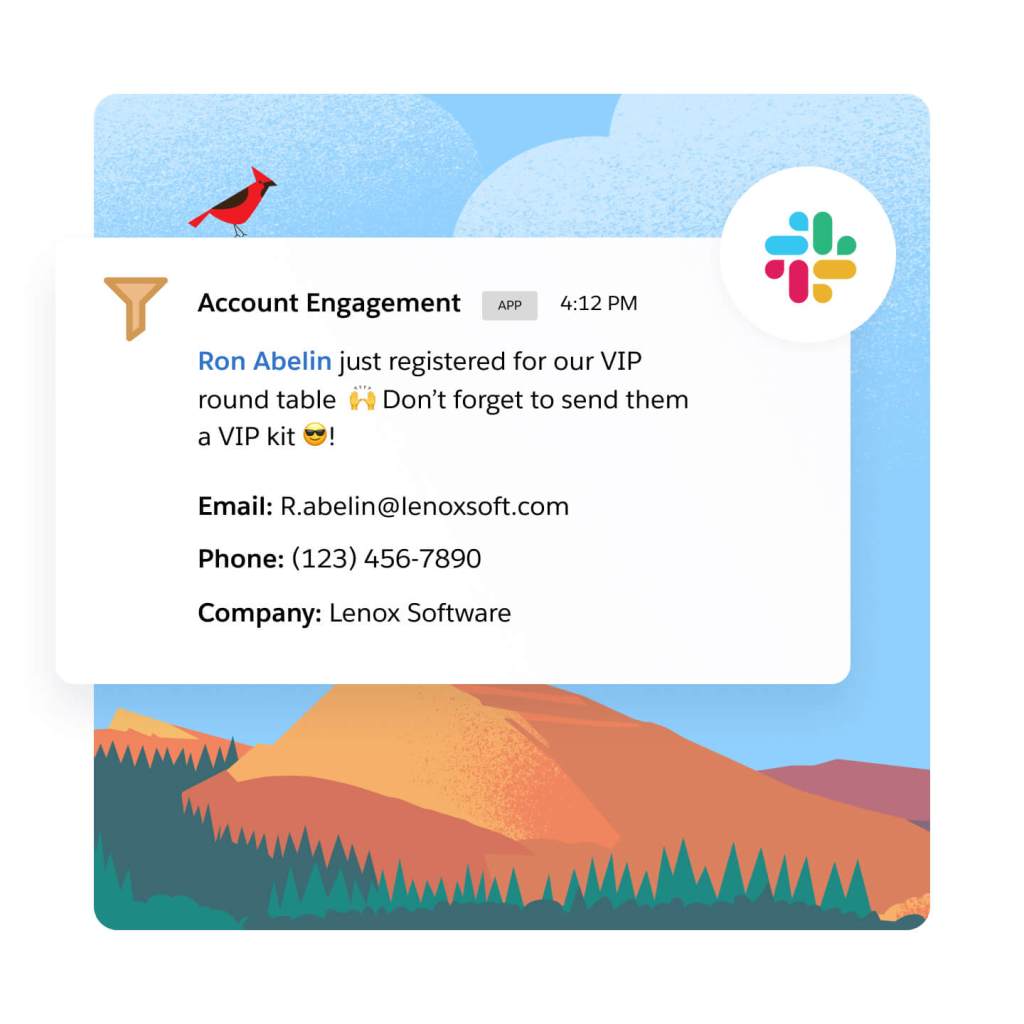
Share insights around a prospect's key marketing interactions with sales and service teams. Alert sales teams the moment a hot lead fills out a form, or when the lead is ready to convert. Also, when a prospect is highly engaged, let sales and service know with automated, triggered alerts in Sales and Service Cloud, or directly in Slack.
Optimize marketing performance and grow customer relationships.
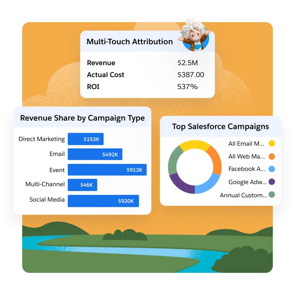
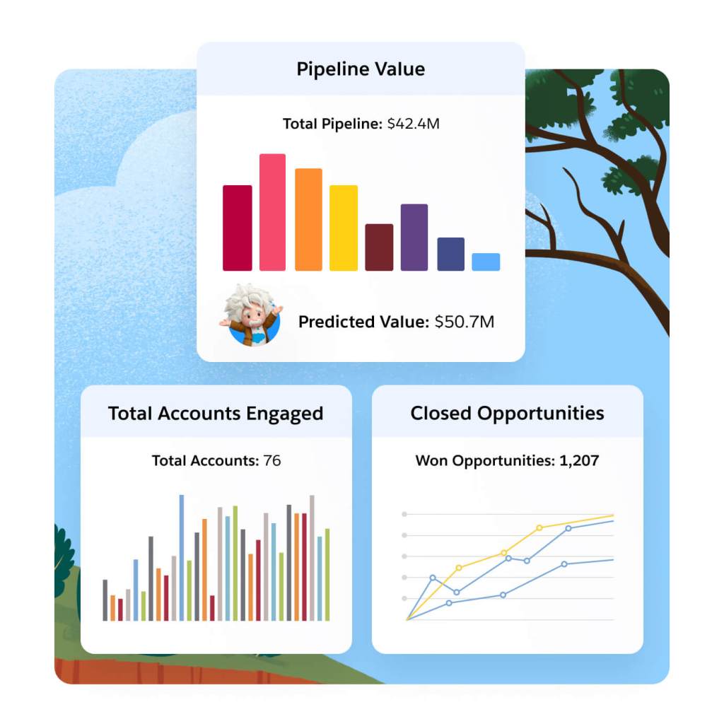
Gain full-funnel marketing and sales insights with AI-powered Multi-Touch Attribution. Choose from multiple native attribution models like Einstein Attribution to gauge the impact of channels, events, and sales team activities on your pipeline. Boost campaign efficacy and ROI with AI-driven insights.
Gain insights into revenue and pipeline for key accounts. Then, use those findings to see how account-based efforts are influencing targeted accounts, and optimize on what's working and what's not. Share what you discover with sales to further plan account-based outreach.
Understand how marketing impacts pipeline and revenue with a direct connection to Sales Cloud. See how marketing messages influence the prospect journey with A/B testing and out-of-the-box email reporting. Then, apply predictive analytics to those insights to make more strategic decisions and identify the campaign factors that will drive conversion.
Extend the power of Marketing Cloud Account Engagement with these related products.
Sales Cloud
Set the foundation for revenue growth with Salesforce automation on the #1 CRM.
Data Cloud for Marketing
Activate your data, scale insights with AI, and unify all your data in a single customer profile.
Marketing Cloud Personalization
Automate dynamic offers for each customer in real time across each moment in the customer journey.
Marketing Cloud Intelligence
Optimize marketing performance and spend across every campaign, channel, and journey.
Get the most out of your B2B marketing automation software with thousands of partner apps and experts.


Marketing Cloud Account Engagement Pricing
Find the right Marketing Cloud Account Engagement edition for your business needs.
Growth
Fuel growth with marketing automation.
$
1,250*
USD/month
up to 10,000 contacts billed annually
- Lead Nurturing and Scoring
- Engagement History Dashboards
- Campaign Reporting and Insights
Plus
Dive deeper with marketing automation and analytics.
$
2,750*
USD/month
up to 10,000 contacts billed annually
- Cross-Channel Journeys
- Multitouch and ABM Dashboards
- B2B Marketing Analytics
Advanced
Power innovation with advanced marketing automation and analytics.
$
4,400*
USD/month
up to 10,000 contacts billed annually
- Dedicated IP Address
- AI-Powered Capabilities
- Business Units and Sandboxes
Premium
Enterprise-ready features with predictive analytics and support.
$
15,000*
USD/month
up to 75,000 contacts billed annually
- Includes All Capabilities
- Premier Success Plan
- Increased Performance and SLA Support
*All per month products require an annual contract.
This page is provided for informational purposes only and is subject to change. Contact a sales representative for detailed pricing information.

Salesforce contributed to our ABM strategy with AI-driven analytics and rich data sources that helped us zero in on high-value business prospects. By identifying the most relevant target accounts, we could focus our marketing efforts on organizations that would benefit highly from our products.
Kelli MeadorSenior Manager, Marketing Operations, Grammarly

Stay up to date on all things marketing.
Sign up for our monthly marketing newsletter to get the latest research, industry insights, and product news delivered straight to your inbox.
Learn new skills with free, guided learning on Trailhead.

Hit the ground running with marketing tips, tricks, and best practices.

Ready to take the next step?
Talk to an expert.
Tell us a bit more so the right person can reach out faster.
Stay up to date.
Get the latest research, industry insights, and product news delivered straight to your inbox.

Marketing Cloud Account Engagement FAQ
Marketing Cloud Account Engagement is the only marketing automation platform built on the world’s #1 CRM. It helps companies grow revenue and scale buyer engagement by uniting customer data on one platform and scaling account relationships with AI. Whether you’re looking to execute on-demand generation or account-based marketing strategies, we've got you covered.
B2B marketing automation software helps automate and streamline marketing processes and multifunctional campaigns across channels. It includes functionalities to manage and nurture leads, run targeted campaigns, align with sales to close deals, and track the effectiveness of marketing efforts.
The benefits of B2B marketing automation platforms are:
- Scaling buyer engagement across accounts
- Aligning revenue teams (marketing, sales, and service) to close deals faster
- Growing pipeline and proving marketing impact
B2B marketing automation software can help your business in the following ways:
- Generating and nurturing leads
- Driving marketing and sales alignment
- Prioritizing and converting qualified leads
- Managing marketing campaigns
- Executing on account-based marketing strategies
- Maximizing marketing ROI
The right B2B marketing automation platform will:
- Integrate directly into your CRM
- Align revenue teams (marketing, sales, and service)
- Execute on multiple marketing strategies (e.g., broad-base demand generation and account-based marketing)
Pardot was part of Exact Target, which was acquired by Salesforce in 2013, and is the legacy product name for Marketing Cloud Account Engagement. They are the same product.
Pardot is the legacy name for Salesforce Account Engagement and is the same product as Pardot.